Course
This lesson is part of a course that teaches you how to build a New Relic application from the ground up. If you haven't already, check out the course introduction.
Each lesson in the course builds upon the last, so make sure you've completed the last lesson, Add chart components to your A/B test application, before starting this one.
In this course, you’re building an A/B test application for the New Relic platform. Previously, you learned about the New Relic One SDK and its component library. Now, It’s time for you to start building your application focusing first on chart components. Before you write any code, consult your design guide to remember what the application will look like when you finish:

There are several charts you need to create, which may seem overwhelming at first, but take it one step at a time. The topmost chart, and the first you’ll create, is a line chart that shows the number of users who sign up for your newsletter and what version of your website they were shown.
Change to the add-your-first-chart/ab-test directory of the coursework repository:
$cd nru-programmability-course/add-your-first-chart/ab-testThis directory contains the code your application should have at this point in the course. By navigating to the correct directory at the start of each lesson, you leave your custom code behind, thereby protecting yourself from carrying incorrect code from one lesson to the next.
In nerdlets/ab-test-nerdlet, add a new Javascript file named newsletter-signups.js:
$touch newsletter-signups.jsIn this new file, create a component called NewsletterSignups to hold your first LineChart and some mock data:
import React from 'react';import { LineChart } from 'nr1';
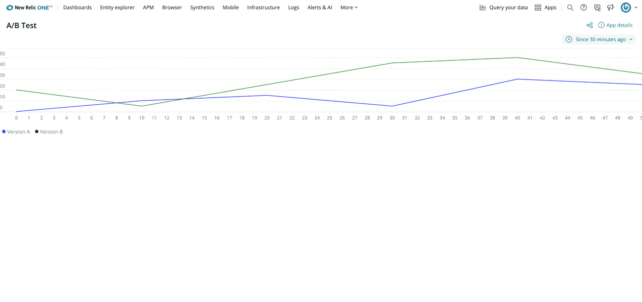
export default class NewsletterSignups extends React.Component { render() { const versionASignups = { metadata: { id: 'version-a-newsletter-signups', name: 'Version A', viz: 'main', color: 'blue', }, data: [ { x: 0, y: 0 }, { x: 10, y: 10 }, { x: 20, y: 15 }, { x: 30, y: 5 }, { x: 40, y: 30 }, { x: 50, y: 25 }, ], } const versionBSignups = { metadata: { id: 'version-b-newsletter-signups', name: 'Version B', viz: 'main', color: 'green', }, data: [ { x: 0, y: 20 }, { x: 10, y: 5 }, { x: 20, y: 25 }, { x: 30, y: 45 }, { x: 40, y: 50 }, { x: 50, y: 35 }, ], } return <LineChart data={[versionASignups, versionBSignups]} fullWidth /> }}Here, you’ve created two arbitrary data series which represent versions A and B of your test. Right now, you're using manually-crafted data points. In the future, you'll replace these with data queried from New Relic.
Notice that you’ve specified a color for each series in the chart. The color metadata attribute takes any CSS-acceptable color format. Setting viz: 'main' means that you want to render the LineChart series as a line, the component's default display style. For the data prop in the LineChart component, you passed the two series in an array so that both are represented together. Finally, you used the chart’s fullWidth prop to stretch the chart’s width to fill the view.
In your Nerdlet's index.js file, import your new component and replace the default heading in your Nerdlet's render() method with your new component:
import React from 'react';import NewsletterSignups from './newsletter-signups';
export default class AbTestNerdletNerdlet extends React.Component { render() { return <div> <NewsletterSignups /> </div> }}Navigate to the root of your Nerdpack at nru-programmability-course/add-your-first-chart/ab-test.
Generate a new UUID for your Nerdpack:
$nr1 nerdpack:uuid -gfBecause you cloned the coursework repository that contained an existing Nerdpack, you need to generate your own unique identifier. This UUID maps your Nerdpack to your New Relic account.
View your changes in New Relic:

Here, you see the LineChart displayed in your application.
When you're finished, stop serving your New Relic application by pressing CTRL+C in your local server's terminal window.
In seven steps, you’ve breathed life into your New Relic application. Instead of a bland “Hello world” message, your application now shows a colorful line chart with two mocked data series. These data series represent server-side traffic for each of the competing designs in your demo website. In the next lesson, you’ll build on this foundation by creating another chart type.
Course
This lesson is part of a course that teaches you how to build a New Relic application from the ground up. When you're ready, continue on to the next lesson: Add pie charts.