Customize your visualization's configurable properties to make it reusable.
In this document, you'll learn what information your visualization's nr1.json file contains, how you can modify it, and how it's used to make your visualization more flexible.
Edit your visualization's metadata
nr1.json is a metadata file that lives in your visualization directory and looks something like this:
{ "schemaType": "VISUALIZATION", "id": "fun-visualization", "displayName": "FunVisualization", "description": "", "configuration": []}It contains the following top-level keys:
schemaType: Nerdpack items all havenr1.jsonmetadata files. TheschemaTypedescribes the item's schema. For all visualizations,schemaTypeisVISUALIZATION.id: Your visualization's string identifier. This must be unique within a given Nerdpack, but it doesn't need to be unique across all Nerdpacks.displayName: The human-readable name that New Relic displays in Custom Visualizationsdescription: The description that New Relic displays in Custom Visualizationsconfiguration: A list of configurable properties for your visualization. You can edit these properties in the web UI and their values are passed to your visualization component.
Declare your visualization's configurable properties
To declare your visualization's configurable properties, you list them under the configuration key in nr1.json:
"configuration": [ { "name": "nrqlQueries", "title": "NRQL Queries", "type": "collection", "items": [ { "name": "accountId", "title": "Account ID", "description": "Account ID to be associated with the query", "type": "number" }, { "name": "query", "title": "Query", "description": "NRQL query for visualization", "type": "nrql" } ] }, { "name": "fill", "title": "Fill color", "description": "A fill color to override the default fill color", "type": "string" }, { "name": "stroke", "title": "Stroke color", "description": "A stroke color to override the default stroke color", "type": "string" }]In this example, nrqlQueries is a collection of query objects. Each query object consists of an accountId and a query. As a collection, you can have multiple query objects in this visualization. fill and stroke are strings that define a color to be used when rendering the visualization.
This example configuration results in the following fields in the visualization's setup UI:
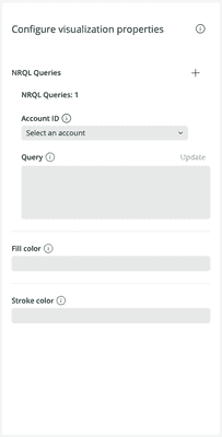
Notice the + next to NRQL Queries, which you can use to add query objects to the collection. You can also remove queries by hovering over them and clicking - if you have more than one. Also notice the tooltip provided for most of the fields. Each tooltip in the UI corresponds to it's field's description, if it has one.
In your React code, you can access the values of these fields in your visualization component's props:
export default class MyCustomVisualization extends React.Component { render() { const { nrqlQueries, stroke, fill } = this.props; return <div> <p>Fill color: { fill }</p> <p>Stroke color: { stroke }</p> <p>First query account ID: { nrqlQueries[0].accountId }</p> <p>First query: { nrqlQueries[0].query }</p> </div> }All configuration objects have the following optional keys:
name: The React component prop nametitle: The UI display namedescription: An tooltip description
All configuration objects require a type key that references the field's data type. Each data type is unique in how it's configured and presented.
boolean
A boolean property is rendered in the UI as a toggle and represents a true or false state.
Example:

{ "schemaType": "VISUALIZATION", "id": "custom-viz", "displayName": "CustomViz", "description": "MyCustomViz", "configuration": [ { "name": "showLabels", "title": "Show labels", "description": "Toggles the visibility of the chart's labels.", "type": "boolean" } ]}import React from 'react';import data from './data';import { RadialBarChart, RadialBar, Legend } from 'recharts';
export default class CustomVizVisualization extends React.Component { render() { const { showLabels } = this.props; const label = showLabels ? { fill: '#666' } : false
return ( <RadialBarChart width={1000} height={700} data={data} > <RadialBar label={label} background dataKey='val' /> <Legend layout='vertical' verticalAlign='middle' align="right" /> </RadialBarChart> ) }}string
A string property is rendered in the UI as a text field and represents a character string.
Example:
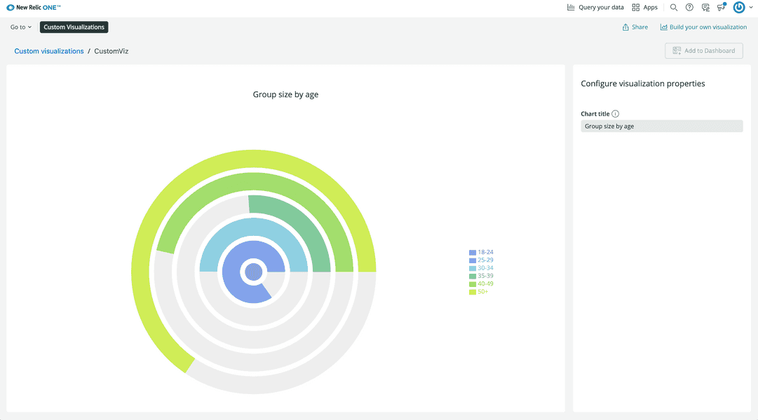
{ "schemaType": "VISUALIZATION", "id": "custom-viz", "displayName": "CustomViz", "description": "MyCustomViz", "configuration": [ { "name": "title", "title": "Chart title", "description": "The chart's title.", "type": "string" } ]}import React from 'react';import data from './data';import { HeadingText } from 'nr1';import { RadialBarChart, RadialBar, Legend, Label } from 'recharts';
export default class CustomVizVisualization extends React.Component { render() { const { title } = this.props;
return ( <div> <HeadingText className="chart-heading"> {title} </HeadingText> <RadialBarChart width={1000} height={700} data={data} > <RadialBar background dataKey='val' /> <Legend layout='vertical' verticalAlign='middle' align="right" /> </RadialBarChart> </div> ) }}number
A number property is rendered in the UI as a text field and represents a number. number props take three extra optional keys:
min: The minimum value the text field can takemax: The maximum value the text field can takestep: The interval between valid values
While these keys are available, they are not enforced. They are purely for UI purposes.
Example:
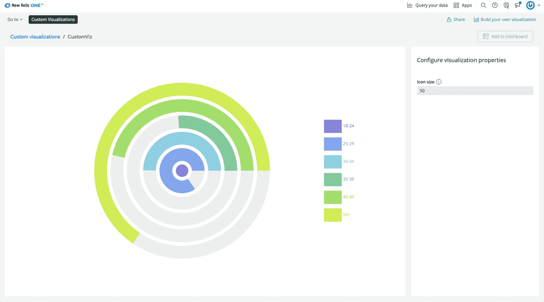
{ "schemaType": "VISUALIZATION", "id": "custom-viz", "displayName": "CustomViz", "description": "MyCustomViz", "configuration": [ { "name": "iconSize", "title": "Icon size", "description": "The size of legend icons.", "type": "number" } ]}import React from 'react';import data from './data';import { RadialBarChart, RadialBar, Legend } from 'recharts';
export default class CustomVizVisualization extends React.Component { render() { const { iconSize } = this.props;
return ( <RadialBarChart width={1000} height={700} data={data} > <RadialBar background dataKey='val' /> <Legend layout='vertical' verticalAlign='middle' align="right" iconSize={iconSize} /> </RadialBarChart> ) }}json
A json property is rendered in the UI as a text box and represents a JSON object.
Example:
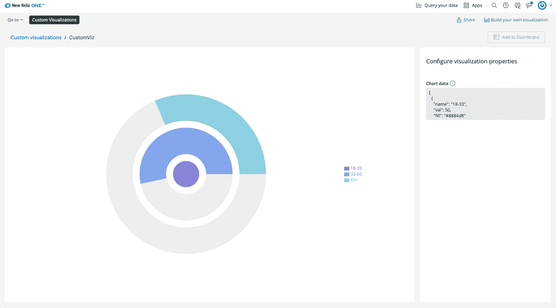
{ "schemaType": "VISUALIZATION", "id": "custom-viz", "displayName": "CustomViz", "description": "MyCustomViz", "configuration": [ { "name": "data", "title": "Chart data", "description": "The data in the chart", "type": "json" } ]}import React from 'react';import { RadialBarChart, RadialBar, Legend } from 'recharts';
export default class CustomVizVisualization extends React.Component { render() { const { data } = this.props;
return ( <RadialBarChart width={1000} height={700} data={JSON.parse(data)} > <RadialBar background dataKey='val' /> <Legend layout='vertical' verticalAlign='middle' align="right" /> </RadialBarChart> ) }}enum
An enum property is rendered in the UI as a drop-down menu and represents a pre-defined list of choices. An enum takes an array of items, each with its own title and value. An item's title is its UI display title. Its value is its React component prop name.
Example:
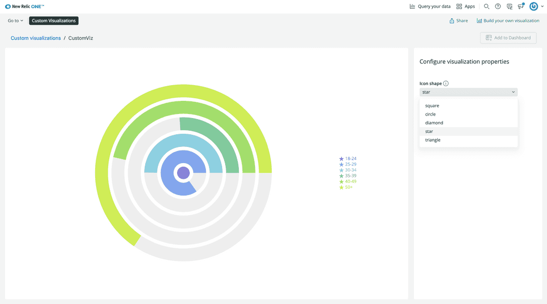
{ "schemaType": "VISUALIZATION", "id": "custom-viz", "displayName": "CustomViz", "description": "MyCustomViz", "configuration": [ { "name": "iconType", "title": "Icon shape", "description": "The shape of legend icons.", "type": "enum", "items": [ { "title": "square", "value": "square" }, { "title": "circle", "value": "circle" }, { "title": "diamond", "value": "diamond" }, { "title": "star", "value": "star" }, { "title": "triangle", "value": "triangle" } ] } ]}import React from 'react';import data from './data';import { RadialBarChart, RadialBar, Legend } from 'recharts';
export default class CustomVizVisualization extends React.Component { render() { const { iconType } = this.props;
return ( <RadialBarChart width={1000} height={700} data={data} > <RadialBar background dataKey='val' /> <Legend layout='vertical' verticalAlign='middle' align="right" iconType={iconType} /> </RadialBarChart> ) }}nrql
A nrql property is rendered in the UI as a text box and represents a NRQL query. You can use the NrqlQuery component from the nr1 component library to query New Relic's database. You may need to transform the data to fit your visualization's needs.
Example:
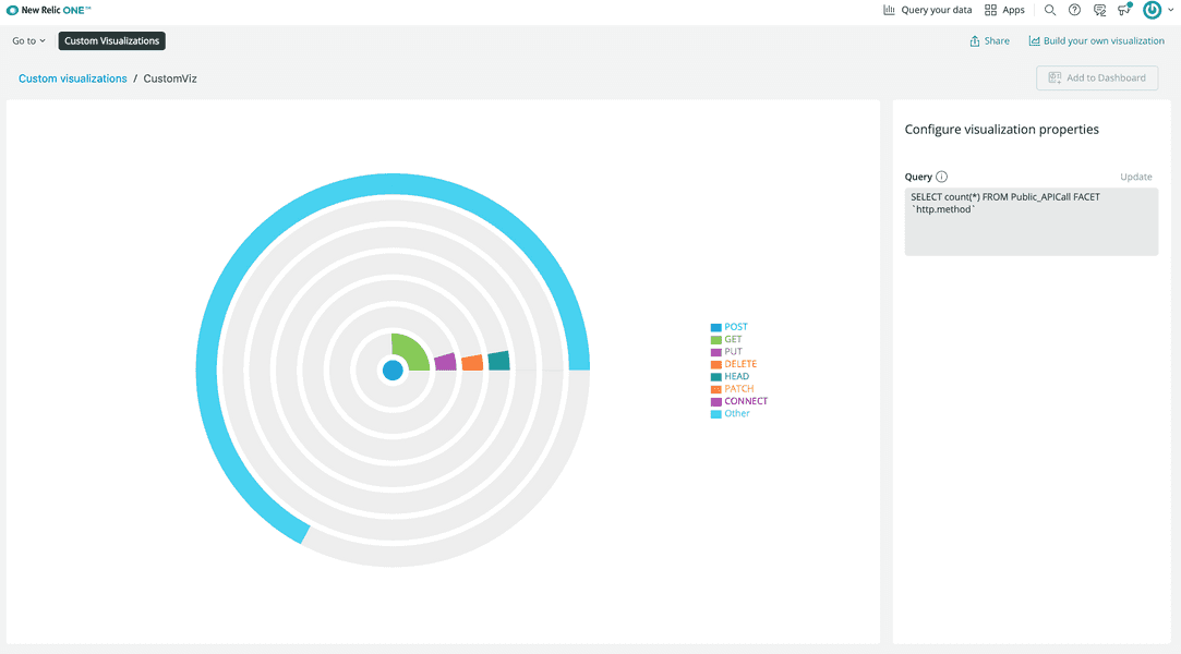
{ "schemaType": "VISUALIZATION", "id": "custom-viz", "displayName": "CustomViz", "description": "MyCustomViz", "configuration": [ { "name": "query", "title": "Query", "description": "The query for chart data.", "type": "nrql" } ]}import React from 'react';import inputData from './data';import { NrqlQuery } from 'nr1';import { RadialBarChart, RadialBar, Legend } from 'recharts';
export default class CustomVizVisualization extends React.Component {
transformData(rawData) { if (rawData) { return rawData.map((entry) => ({ "name": entry.metadata.name, "val": entry.data[0].y, "fill": entry.metadata.color })); } }
render() { const { query } = this.props;
return ( <NrqlQuery accountId={inputData.accountId} query={query} > {({ data }) => { return <RadialBarChart width={1000} height={700} data={this.transformData(data)} > <RadialBar background dataKey='val' /> <Legend layout='vertical' verticalAlign='middle' align="right" /> </RadialBarChart> }} </NrqlQuery> ) }}Important
Although NRQL property can appear anywhere in your configuration, we strongly recommend putting it inside nrqlQueries collection and accompany it with `account-id`. This way we would be able to provide you with the best NRQL editing experience and other useful features (such as dashboard filtering) out of the box.{ "schemaType": "VISUALIZATION", "id": "custom-viz", "displayName": "CustomViz", "description": "MyCustomViz", "configuration": [ { "name": "nrqlQueries", "title": "NRQL Queries", "type": "collection", "items": [ { "name": "query", "title": "Query", "description": "NRQL query for visualization", "type": "nrql" }, { "name": "accountId", "title": "Account ID", "description": "Account ID to run query against", "type": "account-id" } ] } ]}account-id
An account-id property is rendered in the UI as a drop-down menu and represents a New Relic account. From the menu, you can search for and select an account.
Example:
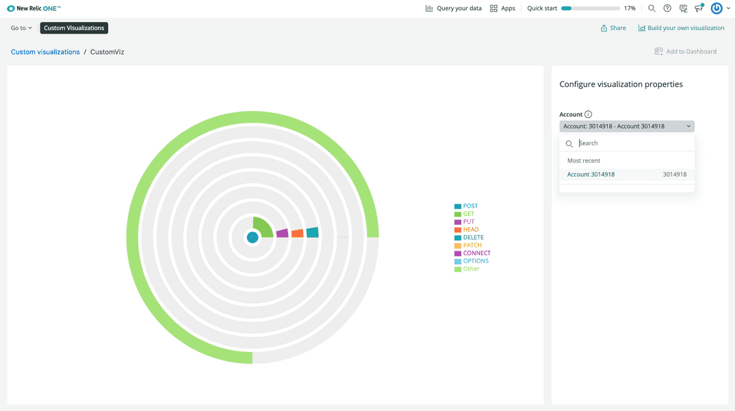
{ "schemaType": "VISUALIZATION", "id": "custom-viz", "displayName": "CustomViz", "description": "MyCustomViz", "configuration": [ { "name": "account", "title": "Account", "description": "Select the appropriate New Relic account", "type": "account-id" } ]}import React from 'react';import { NrqlQuery } from 'nr1';import { RadialBarChart, RadialBar, Legend } from 'recharts';
export default class CustomVizVisualization extends React.Component {
transformData(rawData) { if (rawData) { return rawData.map((entry) => ({ "name": entry.metadata.name, "val": entry.data[0].y, "fill": entry.metadata.color })); } }
render() { const { account } = this.props; const query = "SELECT count(*) FROM Public_APICall FACET `http.method`"
return ( <NrqlQuery accountId={account} query={query} > {({ data }) => { return <RadialBarChart width={1000} height={700} data={this.transformData(data)} > <RadialBar background dataKey='val' /> <Legend layout='vertical' verticalAlign='middle' align="right" /> </RadialBarChart> }} </NrqlQuery> ) }}namespace
A namespace groups properties in the UI under a single heading. A namespace has items which are accessed in code, by name, as attributes of the namespace prop.
Example:
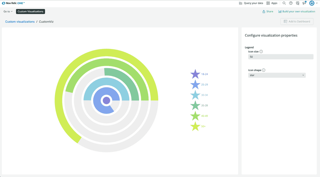
{ "schemaType": "VISUALIZATION", "id": "custom-viz", "displayName": "CustomViz", "description": "MyCustomViz", "configuration": [ { "name": "legend", "title": "Legend", "type": "namespace", "items": [ { "name": "iconSize", "title": "Icon size", "description": "The size of legend icons.", "type": "number" }, { "name": "iconType", "title": "Icon shape", "description": "The shape of legend icons.", "type": "enum", "items": [ { "title": "square", "value": "square" }, { "title": "circle", "value": "circle" }, { "title": "diamond", "value": "diamond" }, { "title": "star", "value": "star" }, { "title": "triangle", "value": "triangle" } ] } ] } ]}import React from 'react';import data from './data';import { RadialBarChart, RadialBar, Legend } from 'recharts';
export default class CustomVizVisualization extends React.Component { render() { const { legend } = this.props;
return ( <RadialBarChart width={1000} height={700} data={data} > <RadialBar background dataKey='val' /> <Legend layout='vertical' verticalAlign='middle' align="right" iconSize={legend.iconSize} iconType={legend.iconType} /> </RadialBarChart> ) }}collection
A collection is a group of repeatable property sets or namespaces under a single heading. When you create a collection, you specify properties for the collection's child items. When you configure a collection in the UI, you can increase or decrease the amount of child items in the collection.
In code, you access the collection prop as an array of items.
Example:
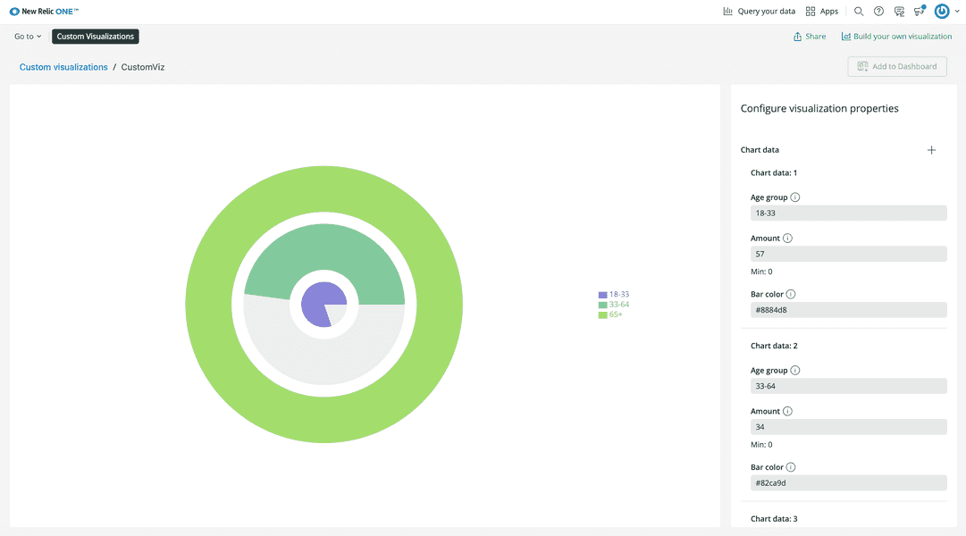
{ "schemaType": "VISUALIZATION", "id": "custom-viz", "displayName": "CustomViz", "description": "MyCustomViz", "configuration": [ { "name": "data", "title": "Chart data", "type": "collection", "items": [ { "name": "name", "title": "Age group", "description": "The age range of the group.", "type": "string" }, { "name": "val", "title": "Amount", "description": "The amount of people in the age group.", "type": "number", "min": 0 }, { "name": "fill", "title": "Bar color", "description": "The color of the chart bar.", "type": "string" } ] } ]}import React from 'react';import { RadialBarChart, RadialBar, Legend } from 'recharts';
export default class CustomVizVisualization extends React.Component { render() { const { data } = this.props;
return ( <RadialBarChart width={1000} height={700} data={data} > <RadialBar background dataKey='val' /> <Legend layout='vertical' verticalAlign='middle' align="right" /> </RadialBarChart> ) }}Use nr1.json
You can freely edit nr1.json, but unlike index.js your locally served visualization requires a restart to see its changes. So, if you're serving your visualization locally, teardown your local server with CTRL+C and spin it up again:
$nr1 nerdpack:serveIf your visualization is already published, you need to update your Nerdpack's version in package.json and publish and subscribe to the new version:
$nr1 nerdpack:publish$nr1 nerdpack:subscribe